
")
")


Okay, this is going to sound a little dramatic… but I swear it’s not.
I accidentally changed the way I see design just by messing with my phone settings.
It actually started because I’ve been using my new Boox Palma 2 lately… and I love it.
Like… the calm, no-glare, no-eye-strain kind of love.
Reading on it feels so different from my phone. My eyes don’t feel tired, my brain doesn’t feel overstimulated, and I don’t get that “I need to look away” feeling after 10 minutes.
So naturally, I had the thought: …can I make my Apple devices feel a little more like this?
And that’s how this whole thing started.
What I Did (Super Simple Setup You Can Steal)
If you want to try it, here’s exactly what I did:
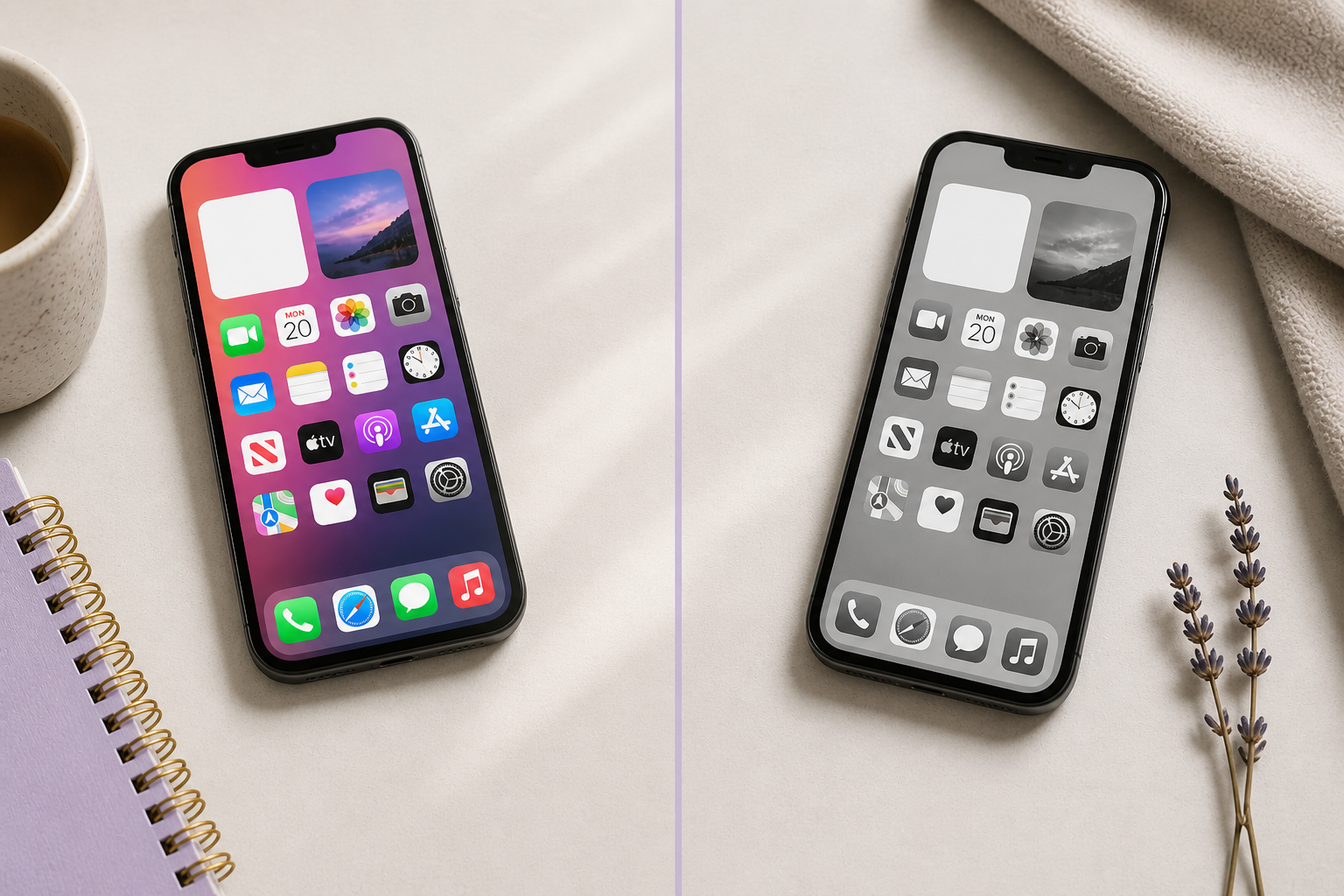
Turn on Grayscale
- Settings → Accessibility
- Display & Text Size
- Color Filters → ON
- Select Grayscale
This removes all the color from your screen.
Reduce White Point (this is the magic part)
- Settings → Accessibility
- Display & Text Size
- Toggle Reduce White Point ON
- Adjust it somewhere between 70–85%
This takes away that harsh brightness that makes your eyes feel like they’re being attacked by your screen 😅
Increase Contrast (this helps everything stay readable)
- Settings → Accessibility
- Display & Text Size
- Toggle Increase Contrast ON
This keeps text and UI elements from getting muddy once color is gone.
Turn on “On/Off Labels” (no more guessing without color)
- Settings → Accessibility
- Display & Text Size
- Toggle On/Off Labels ON
This adds a little line indicator to switches so you can clearly see what’s on or off… even without color.
Optional but very worth it: Shortcut toggle
- Settings → Accessibility → Accessibility Shortcut
- Add:
- Color Filters
- Reduce White Point
Now you can triple-click your side button to turn it on/off whenever you want.
👀 So What Changed Immediately?
I expected it to help my eyes a little.
I did not expect:
- to feel calmer using my phone
- to stop getting that “ugh I don’t want to look at this” feeling
- to actually focus longer
It’s weirdly… peaceful?
Not exactly like my Boox Palma 2… but close enough that I’ve been keeping it on most of the day.
And Then It Messed With My Design Brain (In a Good Way)
This is the part I didn’t see coming.
When everything is black and white, you start noticing what actually makes something work.
Not:
- pretty colors
- trendy palettes
- flashy elements
But:
- spacing
- layout
- readability
- flow
You can’t hide behind color anymore.
If something feels off, you feel it immediately.
The Big Shift for Me
I’ve started thinking about design differently again.
Less:
“Does this look pretty?”
More:
“Does this actually work?”
Can someone:
- read this easily?
- follow the layout without thinking?
- know what to do next?
Because if it doesn’t work in black and white… it probably isn’t as strong as I thought it was.
So, My Final Thoughts…
I’m not giving up color. I still love a good palette moment.
But this has been such a good reset.
It started because I loved how my Boox Palma 2 felt on my eyes…
and somehow turned into a full perspective shift on design.
Less glare.
Less noise.
More intention.
And honestly?
It made me excited about designing again in a way I haven’t felt in a minute.
If you try this, tell me. I’m curious if it hits the same way for you 💛


